
We have been receiving a lot of good feedback on Brain Optimizer BETA and besides the 4 games included, the user interface was one aspect that users loved it.
You understand that as BETA the game is currently limited in options, so a lot of the user interface is still to be unveiled. Nevertheless our goal on Brain Optimizer is to build a simple, clean and sophisticated user interface.
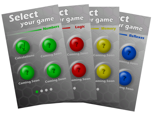
Menus and icons are not the only aspects that define a user interface. Also very important is the consistency through game. An example of consistency are the categories colors in which, all Numbers games are green, all Logic games are red, all Memory games are yellow and all Reflexes games are blue. Another example of consistency is that all games starts with a quick tutorial followed by a 3, 2, 1 countdown. Also all games can end on two ways. A game is considered Completed when the user finishes all the questions in the time given (zero included). On the other hand, a game is considered Time Up when the user fails to finish all the questions on the given time. No matter on the way you end the game you will always be presented with a final score.
So there it is our quick article about Brain Optimizer BETA user interface. We are excited to keep improving this great user interface with new features in the future.